Got you! You did exactly what we wanted by clicking on this article!
Let me explain what just happened here…
Clicking into our article is a result of a ‘Call To Action’ (CTA), which is a text prompt, button or image that encourages readers to take a specific action, i.e., visiting websites, downloading files or buying online. CTAs are everywhere! When used the right way (or in a fun way), it draws in visitors and creates a drive to click and engage with your offering. They don’t have a fixed format or type, but they all serve the same purpose of making the audience do a specific action.
Classic examples in your everyday life are Google’s “I’m Feeling Lucky”, or Facebook’s “Create Story” and “What’s on your mind?”. When shopping online, you might see “Search gift ideas” at the top of the page. You’ve probably also seen CTAs like “Buy Now”, or “Download your free e-book”, which usually appear as buttons, clickable banners, or pop-up windows as well. Without CTAs, viewers would not be aware of the next steps to take, e.g., signing up for a programme or calling to get a quote from a service provider.
Let’s look at some great examples of Call To Actions in use today.
Retail Sale CTA: Shop Now
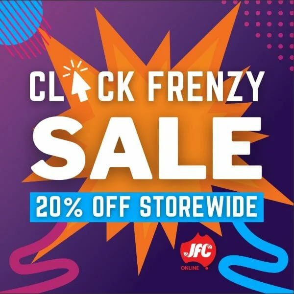
JFC’s Click Frenzy Sale – “Get your fingers ready to tap “Add to Cart” quickly” headline and “Start Your Clicking!” Sale button
JFC is a Japanese Online retailer selling Japanese imported items to Australia and New Zealand. Every so often, JFC launches a 3-day store-wide sale called the “Click Frenzy Sale”. In the spirit of Japanese advertising, which is exciting and fun, they use Call To Actions that suggest speed and excitement. So rather than a straightforward CTA like “Shop Now”, they use wording to generate excitement, suggesting customers have to be quick with their fingers so they can cart out their things immediately.
Retail CTA: New Product Available
Numero – “Get the Numero App”
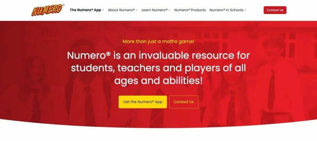
Numero® is a WA-owned and established Mental Maths improvement classic card game. To join the technology revolution, Numero® created an App version of their game and wanted to let everyone know that they could now play online.
The CTA is designed with a yellow background, which makes it stand out from the red background. It also informs you that a Numero App exists, not the classic physical card game. By clicking the CTA, viewers will be able to download the Numero App and start playing the game digitally. As it was the most important CTA on the website for the launch, the button was placed at the top of the home page along with an informative headline to appeal to all audiences.
Sometimes you just need to speak plainly in your CTA to get the best result.
Service CTA: Get a Quote
KDD Conveyancing – “Receive a Quote Now”
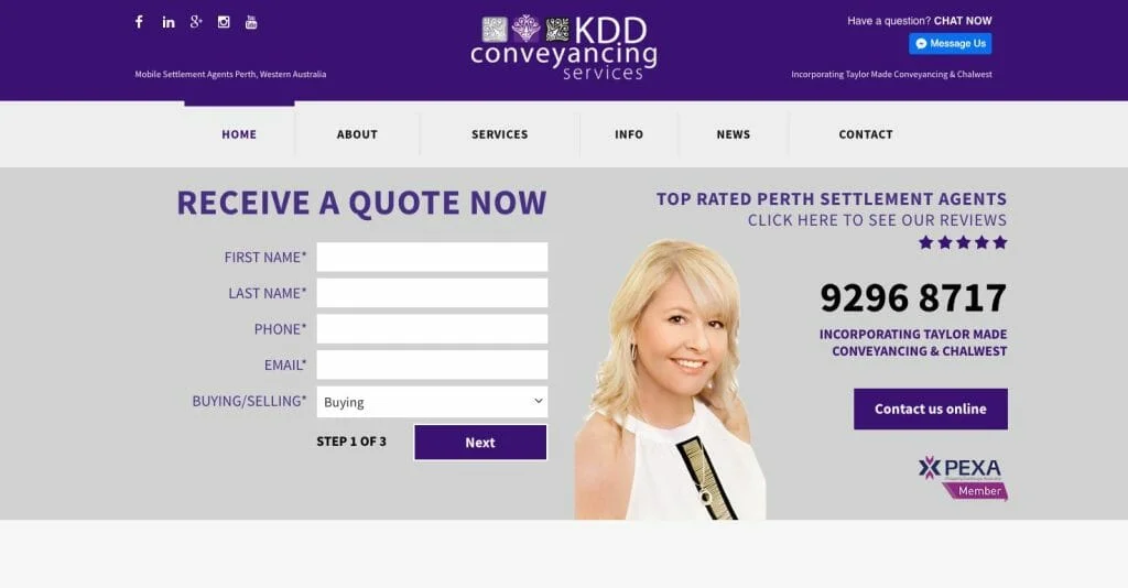
KDD Conveyancing is a settlement agency and consulting firm in Perth, Western Australia. A significant number of their active customers are generated through their initial quote offering on their website. Knowing what their customers were looking for first, they placed their Call To Action heading, “Receive A Quote Now,” at the top of their home page. That way, anyone visiting their website can find and request a quote from KDD Conveyancing instantly, once they have completed the digital form.
Giving them exactly what they want right away.
Service CTA: Product Range And Scope
Parramatta Smash Reviews – “View all the brands that we repair.”
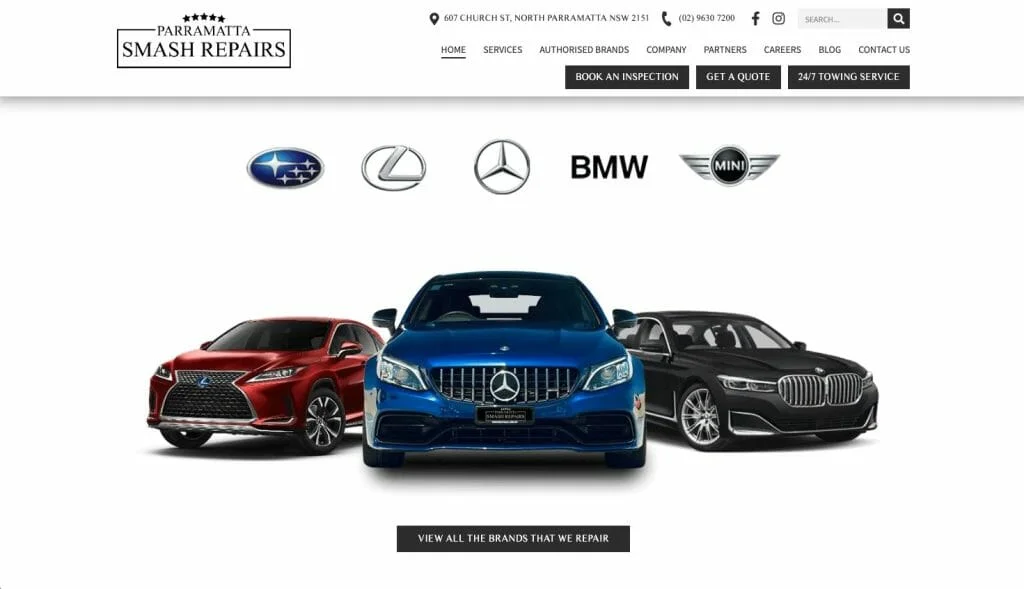
Parramatta Smash Repairs is a premium luxury car smash repairer and maintenance detailer in Parramatta, Sydney. Their customers all own top-performance luxury cars that need a higher level of care and attention, as well as OEM (Original Equipment Manufacturer) parts.
Knowing that their potential new customers would be searching online for a smash repairer that stocks parts for, fits and repairs certain types and models of cars, Parramatta Smash Repairs chose a CTA that answered their customer’s search criteria.
By using the wording “View all the brands that we repair,” the customer can be assured that they are providing the service they are looking for. Alongside the recognisable luxury car brand logos, the CTA also emphasises Parramatta Smash Repairs’ credibility and trustworthiness; that’s a win for the customer and a win for Parramatta Smash Repair.
Service CTA: Booking An Appointment
Lux Aesthetics – “Book now”

Lux Aesthetic Clinic is a Singaporean cosmetic improvement clinic offering non-invasive procedures and treatments for hair, skin, face, and the body. They preferred that their customers book their appointments online rather than call to book and ask about their services. Lux Aesthetic’s strategic placement of the “Book Your Appointment” button at the top of their home page, next to the “View Services” button, offers a convenient way for their customers to book appointments immediately, without the hassle of going through multiple pages. Also, in case the customer missed the first appointment CTA button, there is a second one close by in a different colour.
Now back to your CTA:
After taking a look at effective CTAs, here are some helpful suggestions for effectively using your own CTAs:
- Try to avoid having too many CTAs on one page.
- Too many CTAs can confuse your audience. The best practise is to keep it simple and have one primary CTA in plain sight. If necessary, a secondary CTA can be placed somewhere else in a different colour.
- Use CTAs with more than one word.
- Having just “Download” as your CTA wouldn’t be as convincing to an individual to click the button to download. Instead, specific short phrases with active language would work better, such as “Download your free e-book now”.
- Keep an eye on your CTAs
- Remember to keep tracking and monitoring how well your CTA’s are performing. Utilising A/B testing (split market testing) on CTAs can help determine which option works best for your audience.
Need Help with your CTAs?
Discover more about how you can make your marketing strategy more effective by following our blog or contacting us at Ignite Search for a quote.
