By Airon Rodrigues
Pop-ups for a website can certainly improve a subscriber base, as well as conversions. But at the same time, they can also frustrate or discourage a user from using a website.
However, due to testing, there is no denying that pop-up’s work as the average conversion rate of high-performing pop-ups is 9.28 percent.
What exactly is the purpose of a popup?
Invariably, the purpose is to provide a call-to-action. With this purpose, comes the aim to collect details, such as a name and an email address. Tests have shown that popups are effective, in on test, 1,375% more emails were captured compared to a sidebar opt-in form.
One thing to keep in mind is that there are different types of popups (more on this later). There is the time-based, which is only active after a set amount of time, the content based, which only shows up on a specific page and much more.
Should you be using a popup for your website?
Making popups work and the need to have one depend on the message. What is the goal of having a popup on the website? Is it to drive sales or to collect information to promote a product?
Choosing the right message is critical. What’s even more important is following through on that message through the design. Is the message relevant to the page the popup is presented? Do the design and headline reflect the intent behind the message? These are questions anyone should be asking themselves when contemplating whether to implement a popup on a website.
Along with the right message, comes the right tools. OptinMonster is an easy to use program that is full of features including A/B testing, analytics, and a visual editor. Likewise, SumoMe offers the same features as OptimMonster and is a great tool to get started when creating popups.
Are all popups the same?
Thankfully, there are different popups for different scenarios. Here are the most popular:
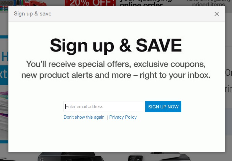
Time-based: No one likes a promotion immediately showing up in their face, which is why a time-based popup can be the difference between a success or a failure. The idea here is to set the popup to work after a set period of time, because at this point, the popup will be presented to a user that’s already engaged with the site, therefore more interested.
Officedepot.com shows a lead generation popup after approximately 60 seconds of landing on the site.
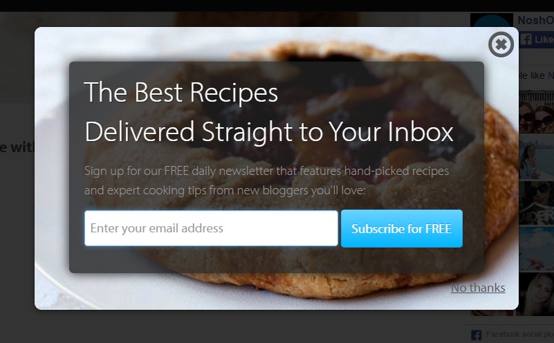
Content-based: Content based popups are really self-explanatory, they only show up on pages with specific content.
The advantage of this type of popup is having control of which page it shows up on. This means is can be tailored to a specific audience that will view that page. This helps increase the relevancy of the popup, as it can be more specific and direct, and, in turn, increase conversion rates.
This popup on Noshon.it only shows when browsing through the recipe related areas of the site.
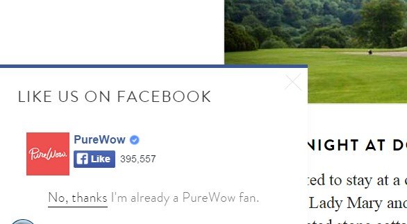
Scroll-based: These types of popups set off when a user has scrolled to a specific part of the page. Like content popups, these also give you the control because you can determine when you want the popup to be present. It can also be tailored to a set audience that always scrolls to a specific part of the page.
This scroll-based popup from Purewow.com shows after 20% page scroll
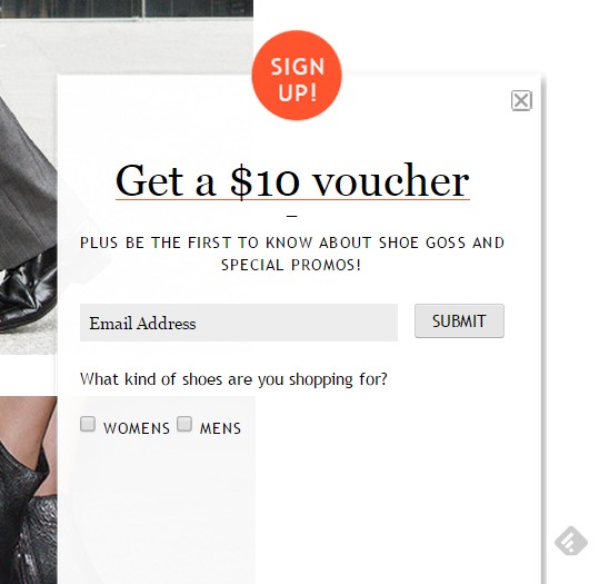
Side-based popups: Side-based popups offer a choice to the user. This type of popups is placed on the side of the screen, which allows the user to keep on scrolling without taking action. The advantage here is that these types are less aggressive and disruptive, and allows the user to decide what they would like to do.
This can be a great popup to test to see how users on a site act when they have the choice to engage with a popup or ignore it.
This pop-out style popup from Styletread.com is shown as soon as the page is loaded, but visitors can still continue browsing.
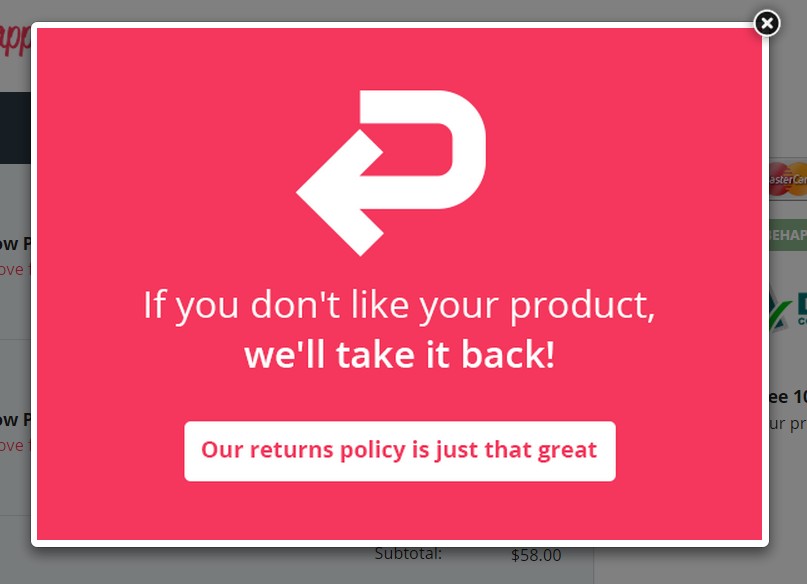
Exit-based popups: Can users exciting a website be convinced to stay that much longer? Possibly. Exit based is the last saving grace of all popups. When a user is about to click the ‘go back’ or close button, the popup will show, trying to persuade the user to stay.
It’s great for a last-ditch effort to offer a pitch, either in the form of a discount or to collect an email address.
Like behappy.me you can use exit-intent popups to combat cart abandonment.
As seen in the previous examples, there are other uses for popups besides collecting email addresses such as:
- Conduct surveys or polls
- Display discounts
- Advertise new products or services
- Promote or announce new events
- Encourage a download or view specific content
- Ask visitors a question to gather more information on their habits
Difference Between Mobile and Desktop
Popups on a mobile compared to desktop are different for a few reasons. The first being that mobile has a different layout, therefore a different design.
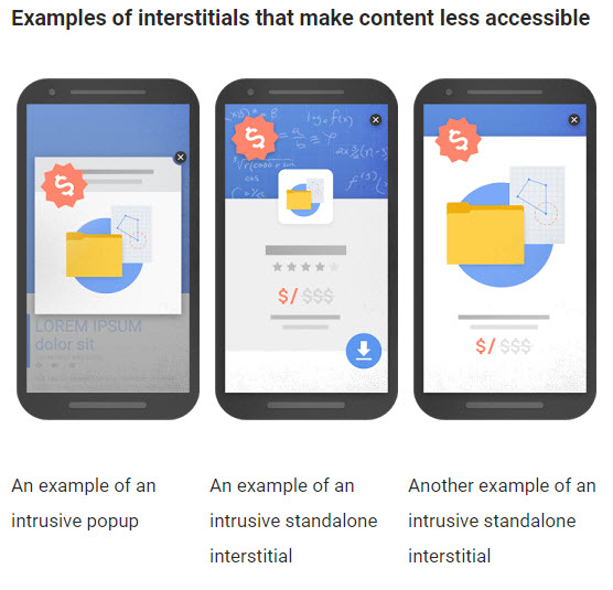
The Webmaster Central Blog explains examples of interstitials that make content less accessible on mobile:
So How Do We Combat this?
- Make the design smaller and easy to access.
- Delay the popup overlay longer than the suggested 10 seconds as sometimes it can take longer for mobile pages to load due to service.
- Ensure popups catch the viewers’ attention but at the same time, are still easily dismissible.
For more info, see the webmaster central blog.
When implementing a popup on a site, always ensure the message is consistent throughout the entire process. Put together a strategy on which type of popup to use an execute it through the tools mentioned above.

